
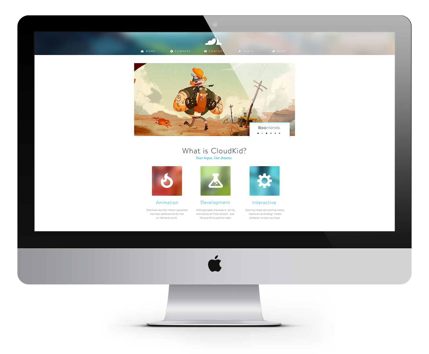
CloudKid
CloudKid, an award-winning digital creative agency, had evolved as a company but their branding remained outdated. It did not reflect the diverse creative and technical work that came to define the studio or the variety of projects we produced. Working with the company founders, my goal was to create an aged-up brand that was clean and professional, yet approachable and casual.

Logo design before and after


Moodboards designed to explore CloudKid's core principles

A small sample of logo pencil sketches


Various vector logo sketches and type exploration
Final logo design with circular grid


Brand color and website exploration (Click to enlarge)


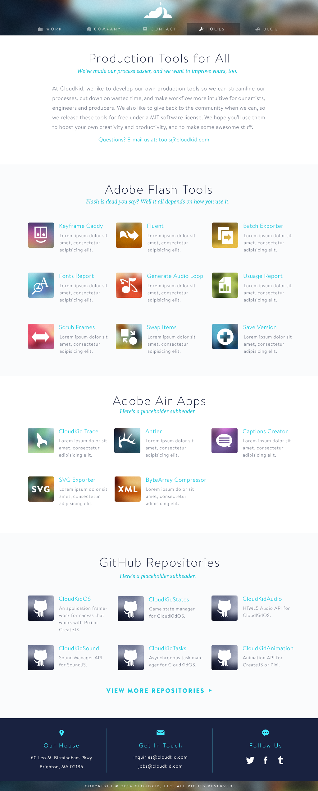

Icons designed for each CloudKid superpower
Business card design with various color options for employees to choose from
A downloadable PDF guide to help animators use CloudKid's Keyframe Caddy Pro


Various CloudKid branded collateral